Context
A new client needed their data to actually work for them.
AtliQ Technologies brought me on to build a first-ever analytics dashboard for a retail client with multiple store locations across New York. The client had years of sales data in MySQL but no way to surface insights from it. The goal was a clean, usable Power BI dashboard that even non-technical store managers could navigate — with filters, drill-throughs, and actionable KPIs.
The entire pipeline: raw MySQL data → SQL analysis and verification → DAX measures in Power BI → five-page interactive dashboard. All DAX measures were cross-verified against SQL queries to ensure 100% data accuracy.
Dashboard Pages
Five pages covering every angle of store performance.
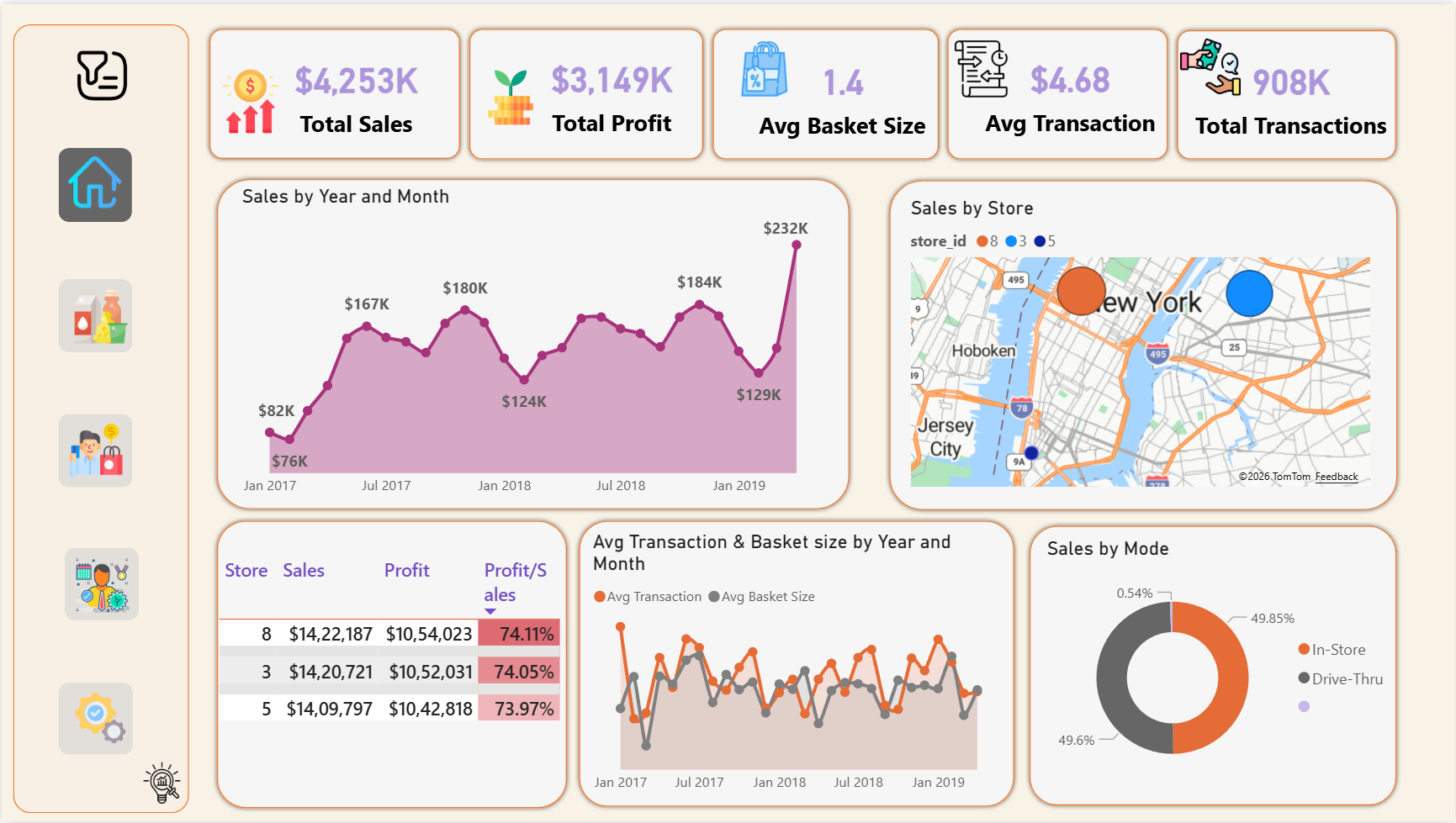
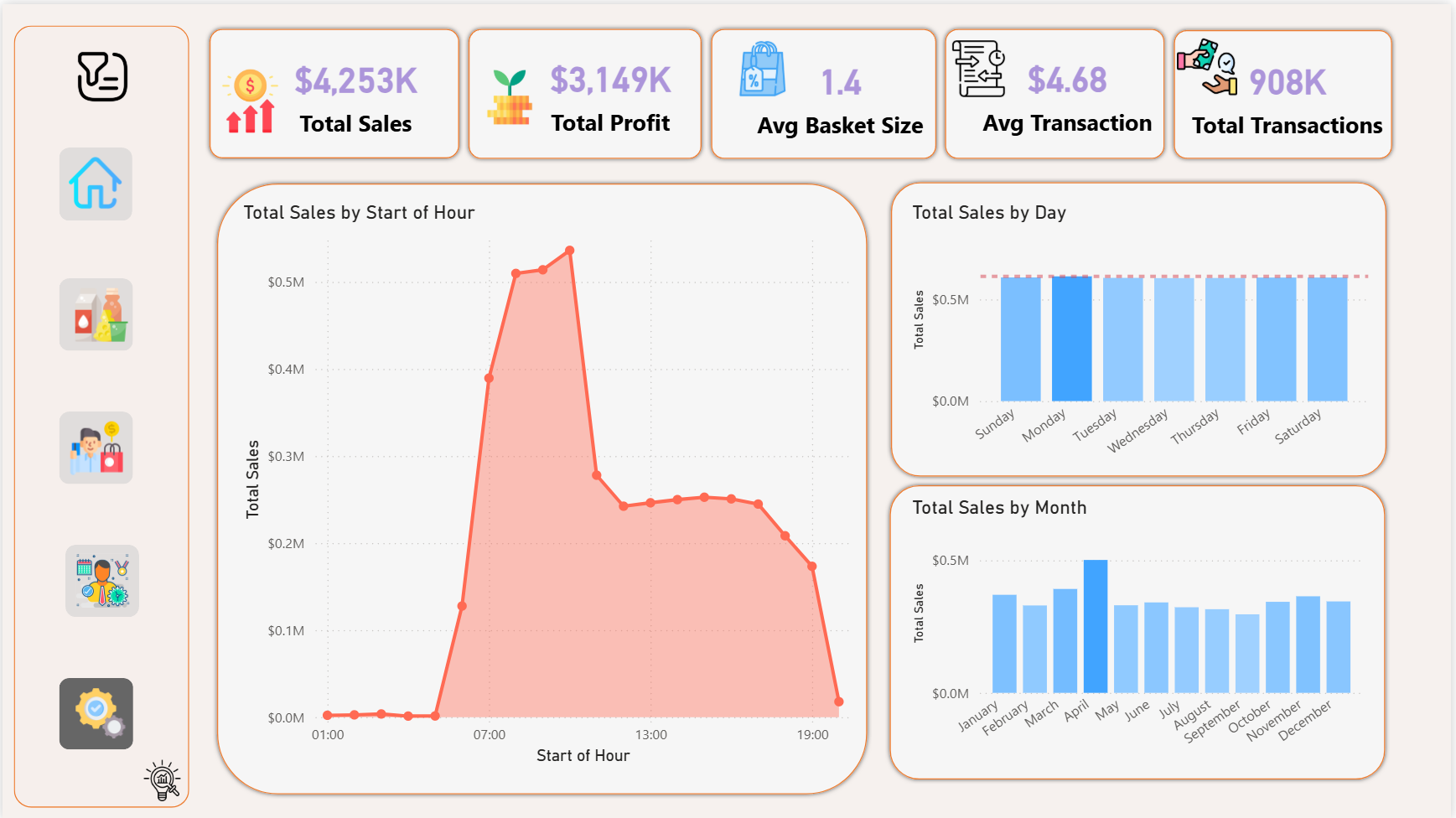
Home
- Total sales, profit, avg basket size
- Sales trend by year and month
- Store location map
- In-store vs Drive-Thru split
- Store-level profit margin table
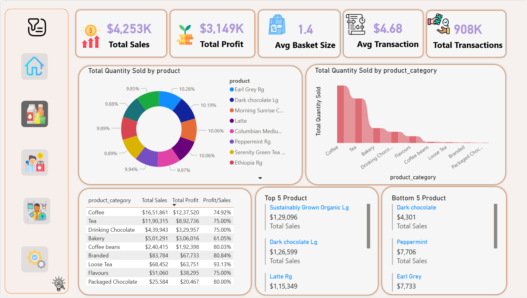
Products
- Top 5 and Bottom 5 products by sales
- Category sales, profit, margin table
- Quantity sold by product (donut chart)
- Quantity by category (ribbon chart)
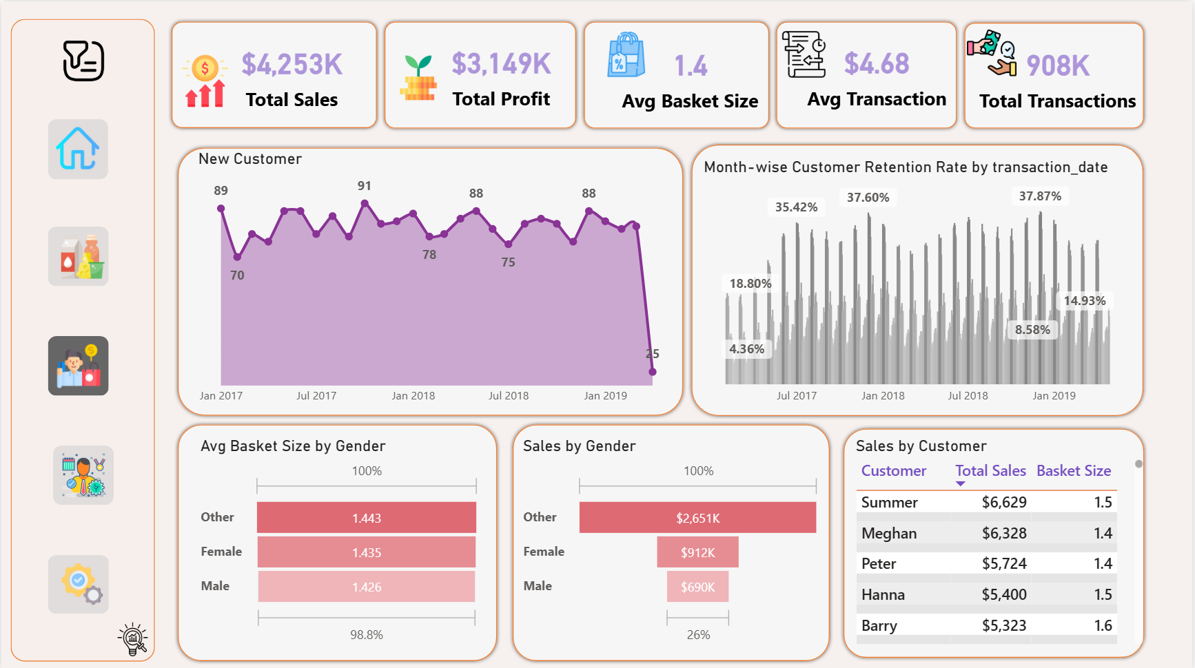
Customers
- Monthly customer retention rate
- New customers by month and year
- Sales by gender (funnel chart)
- Avg basket size by gender
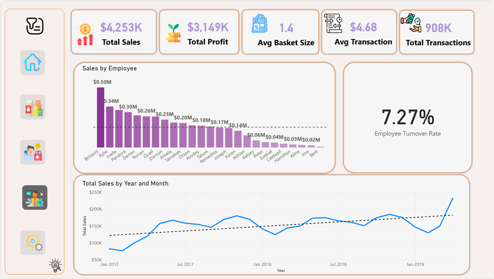
Employees
- Sales by employee (column chart)
- Employee turnover ratio — 7.27%
- Total sales trend by year/month
Operations
- Sales by hour of day (area chart)
- Sales by day of week (bar chart)
- Peak traffic identification
Smart Filters
- Year and month filter
- Store ID filter
- Product category filter
- One-click reset button
Key KPIs
Numbers that drove real decisions.
$4.25M
Total Sales
$3.15M
Total Profit
74%
Avg Profit Margin
1.44
Avg Basket Size
$4.68
Avg Transaction Value
7.27%
Employee Turnover
Key Insights
What the data revealed.
Top 3 employees drove 27% of total sales
Employee performance analysis identified Britanni, Kylie, and Joelle as top contributors — leading to a recommended performance-based incentive model to retain and reward high performers.
Coffee category dominates at $1.65M — but Loose Tea has the highest margin at 93%
Volume and profitability tell different stories. Coffee drives the most revenue but Loose Tea, Branded, and Coffee Beans have the strongest margins — informing pricing and inventory strategy.
Peak sales hour is 07:00–13:00 with a sharp afternoon drop
Operational analysis of hourly sales patterns revealed a clear morning rush window, suggesting staffing and promotional investments should be concentrated in morning hours.
New York store has the highest jam factor — and the highest sales
Store 8 (Manhattan) leads in both traffic congestion and revenue, suggesting that high foot traffic areas correlate with higher transaction volume despite operational challenges.
Tech Stack
SQL verified, DAX modeled, Power BI delivered.
MySQL Workbench
SQL
Power BI Desktop
DAX
Power Query
Star Schema Design
KPI Analysis
Stakeholder Reporting
Results
Insights that moved the business.
14.21%
sales growth attributable to data-driven decisions from this dashboard
100%
DAX measure accuracy verified against SQL query outputs
5
interactive dashboard pages covering every dimension of the business
27%
of total sales attributed to top 3 employees — identified and recommended for incentives
Dashboard Preview
Power BI — 5 pages of insights.
Each page is built on DAX measures verified against SQL — click any tab to preview.
All DAX measures cross-verified against MySQL SQL queries for 100% accuracy. Dashboard built in Power BI Desktop with Power Query for data transformation.